
Gifts & Decor
Cardinal Wall Art: Meaning, Placement and Choosing a Print
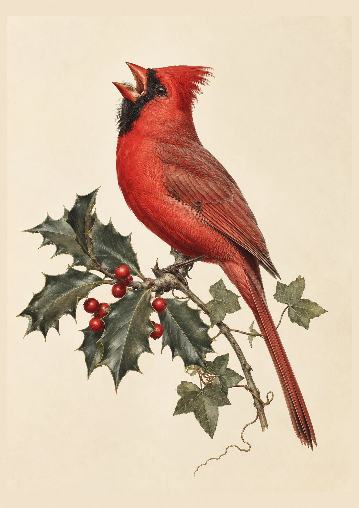
A cardinal on the wall does something a cardinal at the feeder cannot. It stays put. It doesn’t fly off when you walk past. It’s there in July, in a heat wave, when the real bird has gone quiet and you’re missing the sight of him.
That permanence is the whole appeal of cardinal wall art, and it’s worth thinking through before you buy, because where you hang it and what’s around it changes how the piece reads.
Why cardinal red works so hard in a room
Cardinal red is one of the most saturated reds found in nature, and it behaves differently on a wall than a painted red does. It’s warm rather than cool, closer to a true red than a red-orange, and it has enough darkness in it to avoid looking garish even in a large print. This is part of why the bird photographs so well against snow, and it’s the same principle that makes cardinal prints work as a focal point in a room that otherwise leans neutral.
A single cardinal print can carry a whole wall of cream, taupe, or soft grey, because the eye has nothing else competing for attention. This is the effect most people are chasing without knowing the term for it: the print becomes the room’s one deliberate note of colour, and everything else supports it.
What colours pair well with a cardinal print
Navy. This is the classic pairing, and for good reason. Deep navy against cardinal red is a contrast old enough to feel traditional and bold enough to still read as a design choice rather than an accident. It works especially well in a study, library, or formal sitting room.
Cream and warm white. The softest pairing, and the one that suits a farmhouse or cottage-style room. Cream lets the red do all the work without fighting it, and it’s the most forgiving background if you’re not confident mixing colour.
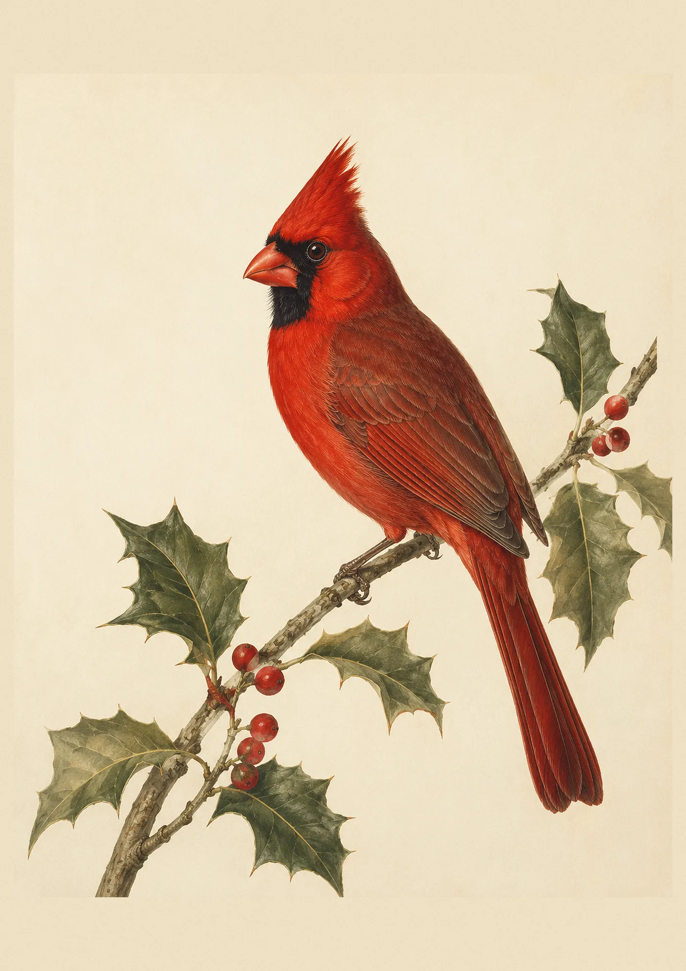
Sage or deep green. A more unexpected pairing, but a natural one, since it echoes the branch and berries the cardinal is usually pictured against. Good for a room that already leans botanical.
Charcoal or deep grey. A modern, slightly more restrained pairing than navy. Suits a room with cleaner lines and less pattern elsewhere.
Gold or brass framing. Whatever wall colour you choose, a warm-toned frame, gold, brass, or a deep wood tone, tends to suit a cardinal print better than a cool silver or black frame. The warmth in the frame echoes the warmth in the bird’s plumage rather than fighting it.
Avoid pairing a cardinal print with another equally saturated, competing colour nearby, like a bright teal sofa or an orange accent wall. The print wants to be the loudest thing in the room, not one of several loud things.
Which room suits cardinal wall art
Living rooms and sitting rooms. The most natural home for a cardinal print, especially over a mantel or sofa, where its colour and scale can anchor the room the way a piece of art is meant to.
Studies and home offices. A single cardinal portrait, rather than a pair or a set, suits a quieter, more solitary room. The courtship-feeding print, by contrast, is a warmer image better suited to shared spaces.
Dining rooms. Cardinal prints have a long association with the table, especially around the winter holidays, and a set of three works well along a dining room wall where guests will notice it over a meal.
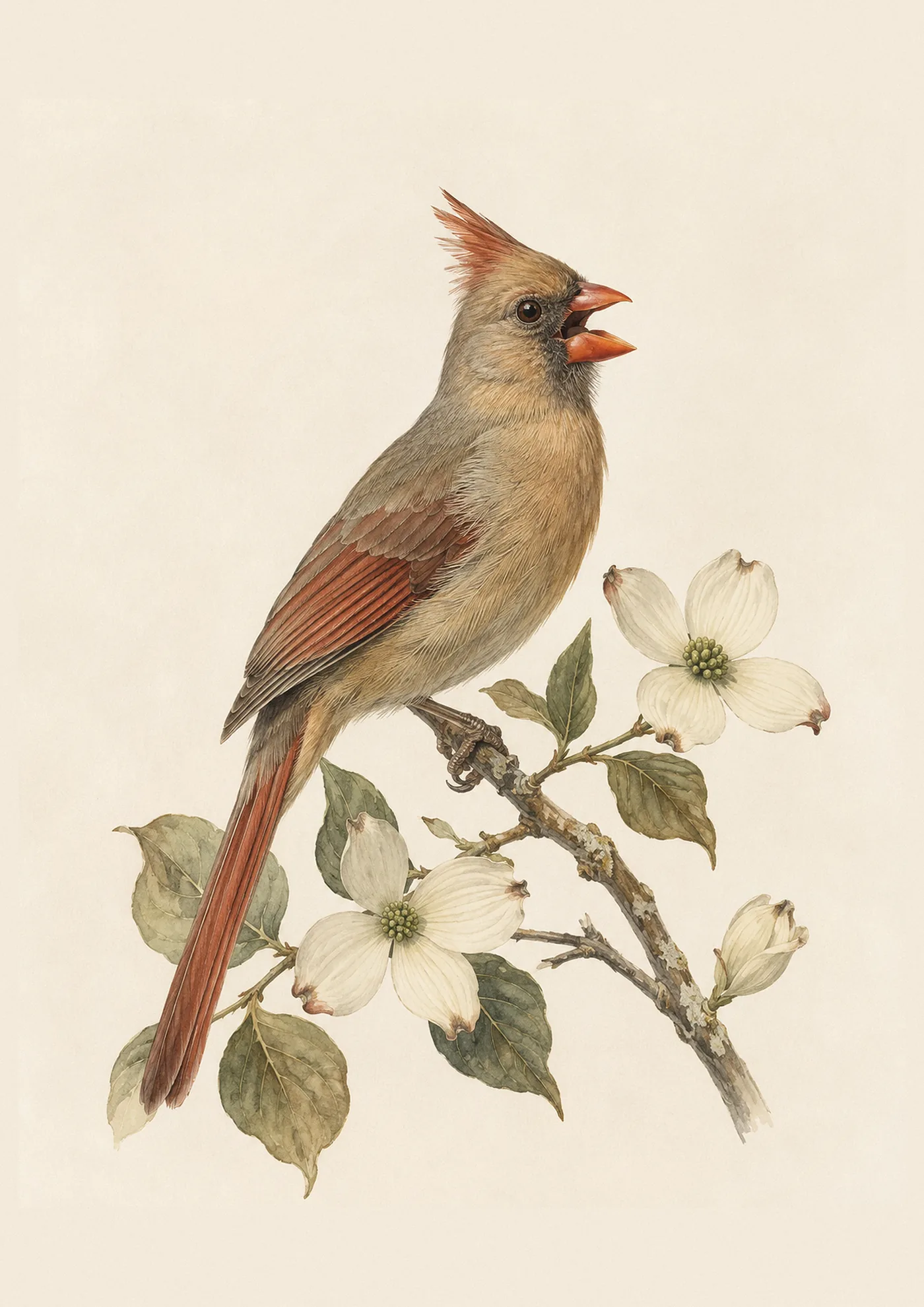
Bedrooms. A gentler choice here, and often the solo female portrait rather than the more attention-grabbing male, for a quieter, more restful feel.
Entryways and hallways. A single, smaller cardinal print near a front door sets a warm tone for a whole home, and it’s often the first thing a guest comments on.
For rooms with a season-specific purpose, like a mantel that gets dressed for the holidays every year, see our Christmas cardinal decor guide for the images built specifically for that use.
Choosing between the prints
Ask yourself what mood you want the wall to carry, more than which specific cardinal image looks nicest in isolation.
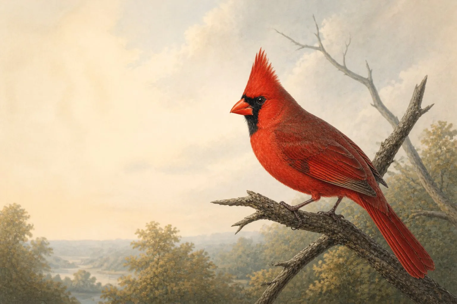
- The classic solo male portrait reads as timeless and works in nearly any room. If you only want one cardinal print, this is usually the right one.
- The female portrait is a quieter, understated choice, and a good pick for anyone who wants a cardinal print without the room feeling dominated by bright red.
- The pair on the branch suits a shared space, a living room or dining room, and reads warmer and more personal than a solo portrait. It also suits an anniversary or wedding gift, which we cover in the wider gift guide for cardinal lovers.
- The male in snow is the most seasonal of the group and pairs naturally with a winter colour scheme, cool whites and greys with the red as the only warm note. It’s also the single most-photographed image of the bird in the wild, for reasons we cover in cardinals in the snow, if you want to understand why this particular pairing of red and white works so well before you commit to it for a wall.
- The courtship-feeding print is the most tender image in the collection, better suited to a bedroom or a quiet reading corner than a main gathering room.
- The set of three, hung together, gives you the range of the bird across a season in one arrangement, and reads as a proper gallery wall rather than a single accent piece.
A fine-art cardinal print in the Audubon tradition starts from $39 unframed and from $99 framed, with a $12 digital download available for anyone who wants to frame it locally. Shipping is free worldwide, and every print is made to order, shipping within about a week.
What the cardinal brings to a room, beyond colour
Cardinal symbolism runs deeper than decor, and it’s worth knowing if you’re choosing this print as more than a colour match. The bird carries associations with loyalty, since cardinals pair for life and are often seen together, and with quiet perseverance, since he is one of the few bright birds that stays through the hardest months of winter rather than leaving. Our full cardinal symbolism guide covers where these associations come from and which are genuinely old versus more recently popularised.
Many people choose a cardinal print for exactly this reason: it’s not simply a pretty bird, it’s a bird that means something to them personally, whether that’s a lost loved one, a long marriage, or simply a favourite visitor at the winter feeder. If that’s your reason for buying, our cardinal memorial gifts guide may also be useful, particularly if the print is meant to honour someone.
FAQ
What colour wall does a cardinal print look best against?
Cream, warm white, and deep navy are the three most reliable backgrounds. Cream is the softest and most forgiving; navy gives the strongest, most traditional contrast. Avoid busy wallpaper or another equally saturated colour competing nearby.
Where should I hang a cardinal print in my home?
Living rooms and dining rooms suit larger or paired cardinal prints well, especially over a mantel or sofa. Bedrooms and studies suit a single, quieter portrait, and entryways work well for a smaller print that sets the tone as guests arrive.
Should I choose a framed or unframed cardinal print?
Framed is the easier choice if you want to hang it immediately without extra steps. Unframed or a digital download suits anyone with a specific frame already in mind, or who wants to match an existing gallery wall.
Does a cardinal print need to match other bird art in the room?
No. A single cardinal print works well as a standalone statement piece precisely because of its strong colour. If you do want to build it into a broader collection, the set of three is designed to be hung together and gives you that gallery-wall effect in one purchase.