Gifts & Decor
Audubon-Style Prints for a Gallery Wall: How to Arrange Them
A single bird print reads as decoration. Three or five of them, arranged with intention, read as a collection. The difference isn’t the art, it’s the arrangement, and it’s almost entirely a matter of a few rules that framers and gallerists have relied on for a hundred years.
Here’s how to take a set of Audubon-style prints and turn them into a wall worth stopping in front of.
Why odd numbers work better than even ones
Three prints, five prints, seven prints. Not two, not four, not six. This isn’t superstition, it’s how the eye moves. An even number of pieces tends to split into pairs, and pairs read as static, a mirror rather than a composition. An odd number always has a center, whether that’s a middle print, a middle gap, or a middle cluster, and a center gives the eye somewhere to land before it starts moving outward.
Three is the easiest starting point for a first gallery wall: one dominant print flanked by two smaller or quieter ones. Five and seven suit a longer wall, a staircase, or a hallway, where the arrangement needs to read from a distance as well as up close.
How much space to leave between prints
Two to three inches between frames is the standard gallery spacing, close enough that the prints read as one grouping, far enough apart that each piece keeps its own breathing room. Closer than two inches and the wall starts to feel cluttered. Further than four or five inches and the prints stop reading as a set at all, each one drifting back into being its own separate decision.
The exception is a true salon-style wall, prints stacked edge to edge with almost no gap, which is its own look entirely and works best with a large collection (eight pieces or more) rather than a starter set of three.
Mixing sizes: the 8x10, 16x20, 24x30 approach
A wall of identical sizes is easy to plan and, often, a little flat. Mixing an 8x10, a 16x20, and a 24x30 does more work: the largest piece anchors the arrangement, the mid-size print carries the eye across, and the smallest adds detail without competing for attention.
A simple, reliable layout: hang the 24x30 slightly off-center, the 16x20 to one side at a height that overlaps its top or bottom edge, and the 8x10 tucked into the remaining corner. This isn’t a strict grid, it’s closer to a loose triangle, and that asymmetry is what keeps a mixed-size wall from looking like a chart.
If a strict grid is more your style, matching sizes in a tight 2x2 or 3x3 layout with even spacing gives a cleaner, more formal look. Both approaches work. The mistake is starting a mixed-size wall and then trying to force it into even rows.
Matching frames or mixed frames?
Matching frames, same finish, same width of molding, is the safer choice and the one that reads as more intentional to a first-time visitor. A cream mat with a slim black or walnut frame across every print in the set is close to foolproof, especially for a first gallery wall.
Mixed frames work too, but they ask more of the room. A mix of black, gold, and natural wood frames can look curated and collected-over-time, the way a real gallery wall assembled across years actually looks, but it needs a unifying thread to avoid looking accidental. That thread is usually the mat: keep every mat the same cream or white, and let the frames vary. The consistency in the mats holds the wall together even when the frames don’t match.
One species, or a mixed wall?
Both are legitimate choices, and the right one depends on what the wall is for.
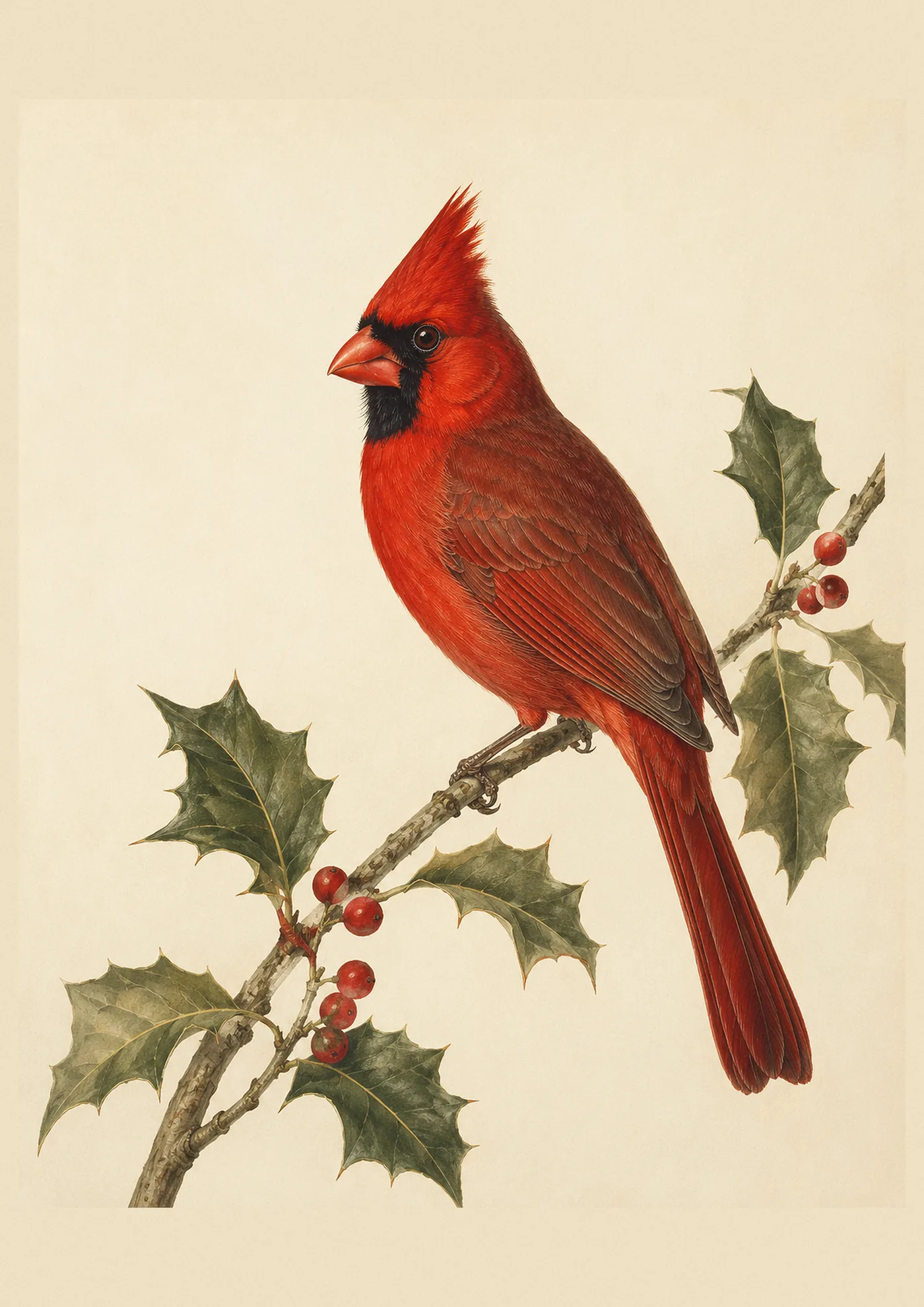
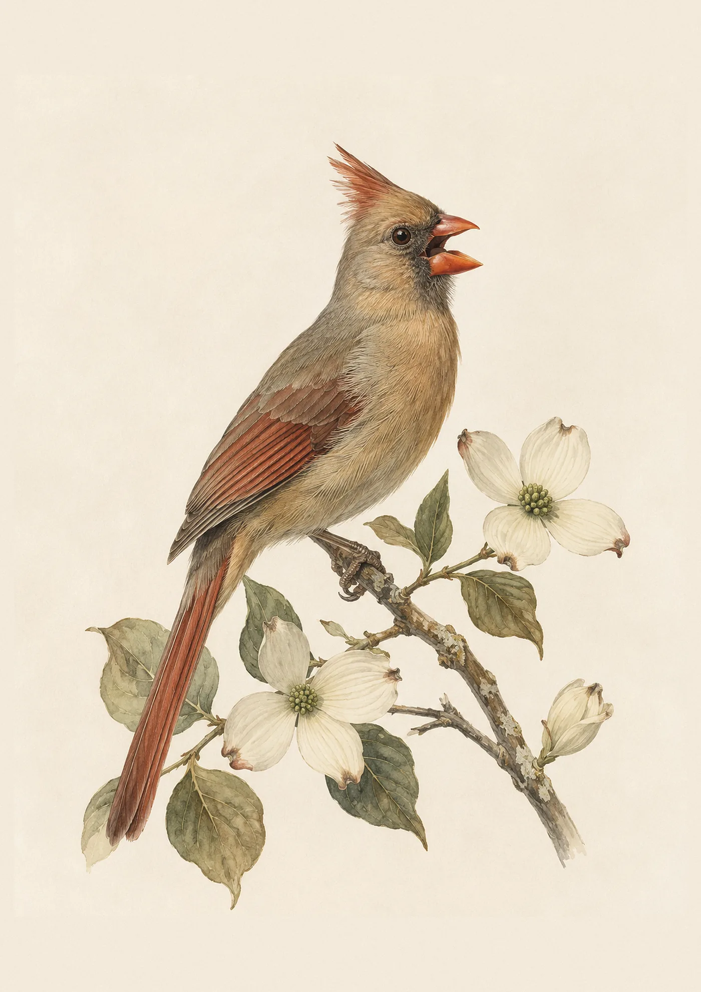
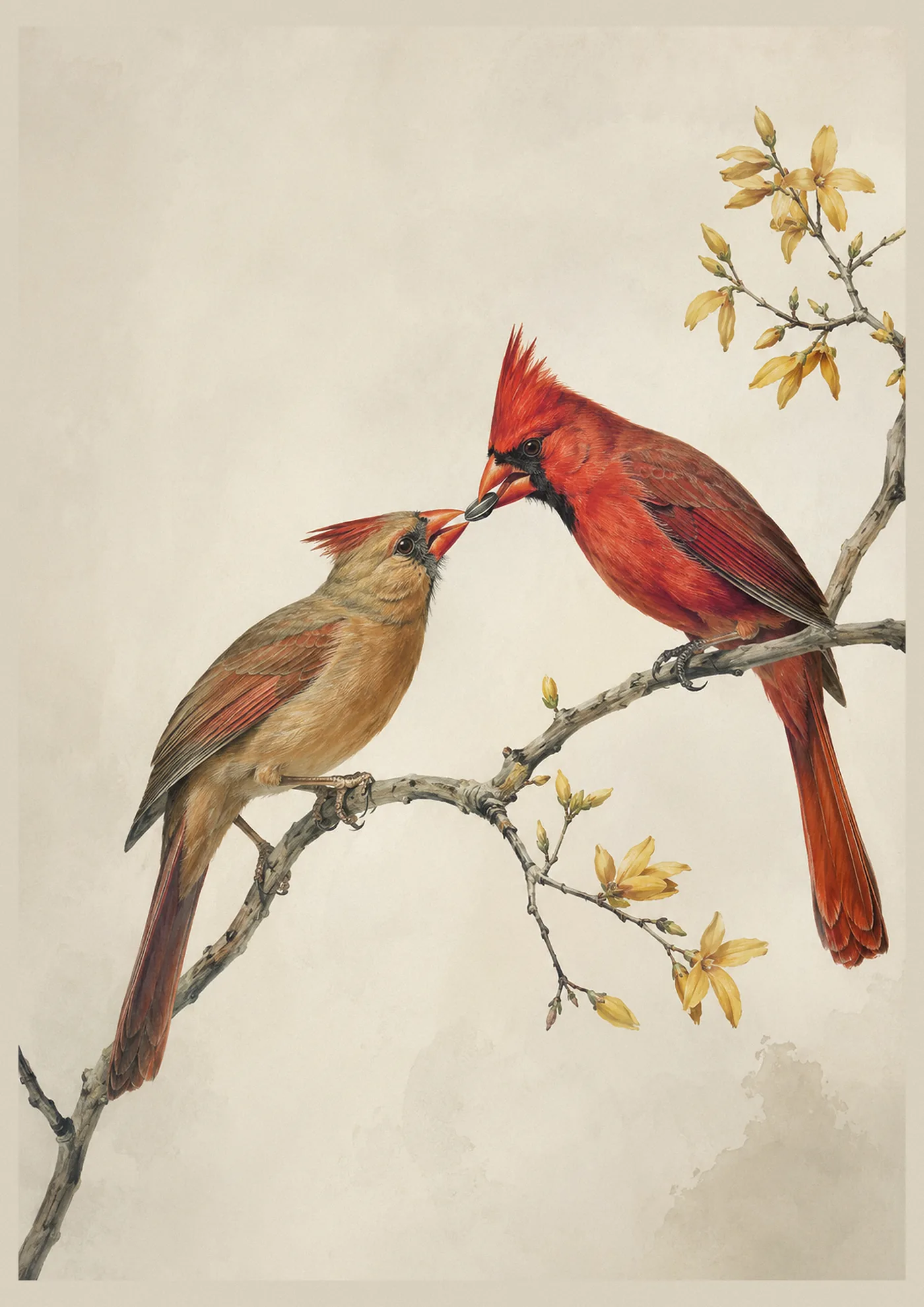
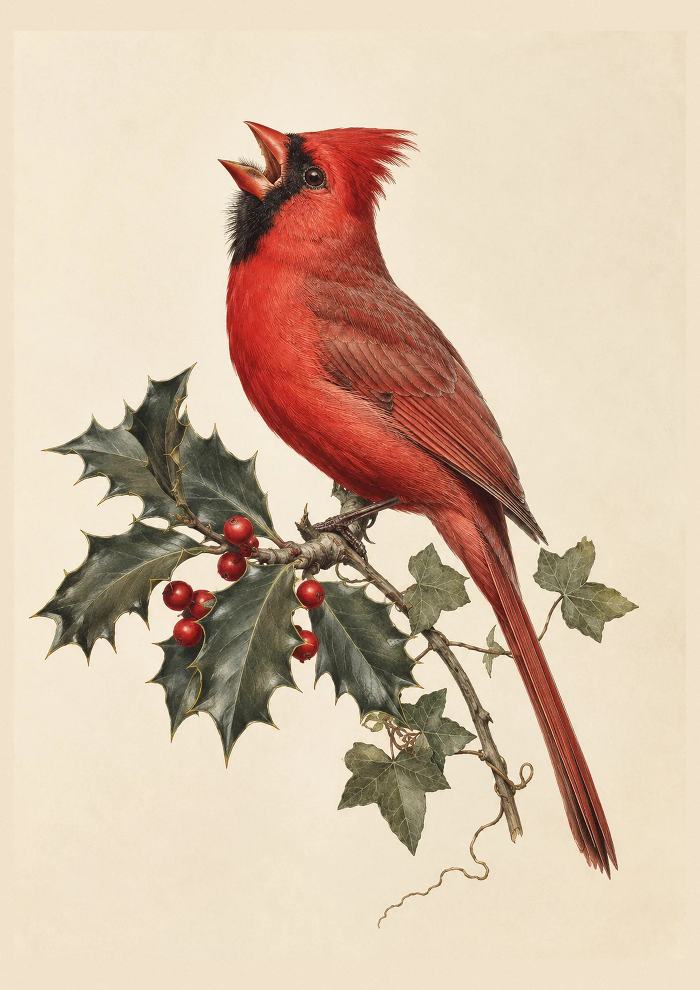
A one-species set, three cardinal prints, or three owls, works beautifully in a room with a single clear character: a den built around owls, a kitchen that’s already gone all-in on cardinals for the holidays. It reads as deliberate and collected, and it’s the easier arrangement to shop for since every piece can come from the same product listing. Cardinals are the most common single-species gallery wall we see, and our guide to cardinal wall art covers placement and meaning in more depth if that’s the direction you’re headed.
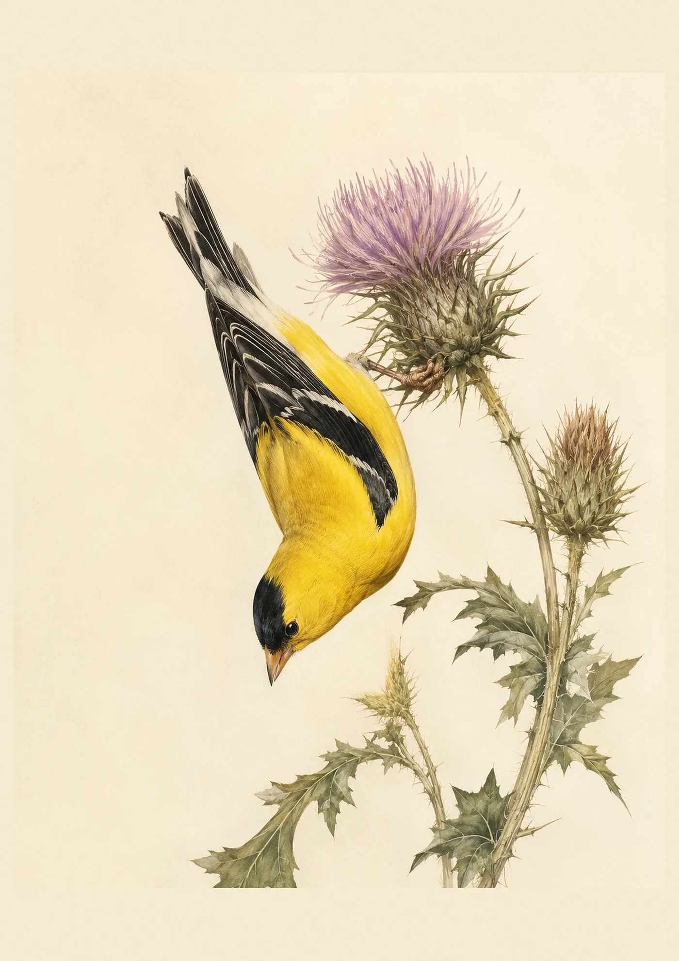
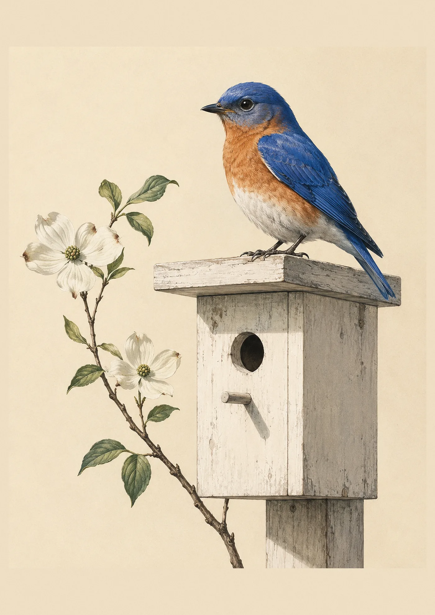
A mixed wall, a bluebird, a goldfinch, an owl, tells a broader story: a life spent watching many species rather than one. This is the natural choice for a birder’s study or a hallway meant to hold a family’s collected interest in birds generally rather than one favorite. It also gives a mixed wall more room to grow over time, since a new print of almost any species can be added later without breaking a single-species theme.
If in doubt, mixed. A wall of three or four different birds, similar in tone and palette, tends to feel more like a considered print collection and less like a single poster that got tripled.
What if the wall isn’t rectangular?
Stairwells, sloped ceilings, and narrow hallways all break the standard rules a little. On a staircase, follow the slope of the stairs with the bottom edges of the frames rather than lining up the tops, so the whole run climbs at the same angle the stairs do. In a narrow hallway, favor vertical prints (a portrait-orientation bird on a branch, rather than a wide landscape composition) so the wall doesn’t feel more crowded than it already is.
Building the wall in stages, rather than all at once
Not every gallery wall needs to arrive as a finished set. A common, low-risk approach: start with a single anchor print, the largest piece, hung alone for a season or two, and add the smaller supporting prints once you’re certain of the room’s light and the wall’s proportions. This is especially useful in a newly decorated room, where furniture and rugs are still settling in and a full five-print commitment feels premature.
The trade-off is that a staged wall asks you to measure carefully from the start, even before the second and third prints exist, so the eventual spacing works out. Photograph the wall after the first print goes up, sketch the planned positions for the rest directly onto the photo, and keep that sketch on hand for whenever the next print arrives.
Lighting a gallery wall properly
A gallery wall lives or dies on its lighting as much as its arrangement. Direct, harsh overhead light tends to wash out the finer detail in a fine-art print, especially the subtler background tones behind a bird’s plumage. A warm-toned lamp angled across the wall, or picture lights mounted above each frame, brings out the depth in a Hahnemühle print far better than a single overhead fixture ever will. Avoid placing any print in direct sunlight for extended periods, which fades even archival-quality paper over years.
Choosing a wall that suits the collection
Not every wall in a house is a good gallery-wall candidate. A wall that gets heavy daily traffic, a stairwell landing, a hallway to a bathroom, works well because people pass it slowly and repeatedly, which is exactly the kind of viewing a considered arrangement rewards. A wall behind a television, by contrast, rarely works, since the television draws every eye in the room and the prints become background. The best gallery walls tend to be the ones in transitional spaces: entryways, staircases, the wall opposite a favorite reading chair.
A seasonal variation worth knowing: some collectors swap one print in and out of an otherwise fixed arrangement for the holidays, adding a piece like our Christmas cardinal print to a permanent set each December and returning to the year-round arrangement in January. It’s a low-effort way to keep a gallery wall feeling current without redesigning it twice a year.
Planning it before you hang anything
Cut kraft paper or newspaper to the exact size of each frame, tape the paper cutouts to the wall in your planned arrangement, step back, and live with it for a day before a single nail goes in. This is the one step that separates a gallery wall that looks planned from one that looks improvised, and it costs nothing but an afternoon.
For a first-time arrangement, our gallery-wall category makes it easy to browse complete sets sized to work together, so the size-mixing and species-pairing decisions are already made for you.
FAQ
How many prints do I need to start a gallery wall?
Three is enough to read as a wall rather than a single framed piece. Most first-time gallery walls run three to five prints; anything smaller and the eye doesn’t register a grouping at all.
Should all my prints be framed the same way?
It’s the safer, more foolproof choice, especially for a first attempt. Matching frames with matching mats read as intentional almost automatically. Mixed frames can work but need a consistent mat color to hold the arrangement together.
What height should the center of a gallery wall sit at?
Standard gallery height puts the visual center of the whole arrangement around 57 to 60 inches from the floor, roughly eye level for most adults standing. For a wall above a sofa or console, leave 6 to 8 inches between the top of the furniture and the bottom of the frames.
Can I mix a cardinal print with a state bird print?
Yes, and it often works well. A signature species print alongside a birds-of-your-state plate ties a personal favorite to a sense of place, which is a natural pairing for a hallway or entryway.